Introduction to Colour Psychology in UK Interiors
The psychology of colour plays a pivotal role in shaping the ambience and emotional impact of our living spaces. In the UK, where weather patterns often bring overcast skies and shorter daylight hours, the colours chosen for home interiors take on even greater significance. Homeowners and designers alike are increasingly aware of how different shades can uplift mood, foster relaxation, or create a sense of warmth and comfort. Colour psychology, the study of how hues influence human behaviour and feelings, has deep roots in British culture—drawing from historical associations with regal blues, stately greens, and rich burgundies found in heritage homes and period properties. Today’s trends see a blend of tradition and modernity as British interiors balance timeless palettes with bold contemporary choices. Understanding the fundamentals of colour psychology not only allows for more intentional design but also aligns with growing investment interest in home improvement—a sector that consistently outperforms broader markets during periods of economic uncertainty. By considering cultural context and historical precedent, UK homeowners can make informed decisions that enhance both their living experience and property value.
Classic British Hues: Timeless Choices and Their Effects
When it comes to designing UK homes, classic British hues have long been revered for their ability to evoke a sense of heritage, comfort, and understated elegance. These traditional palettes—featuring deep greens reminiscent of the English countryside, muted blues echoing coastal vistas, and versatile neutral tones inspired by natural stone—are more than aesthetic choices; they deeply influence the psychological atmosphere within a space. Understanding how these shades impact mood is key for homeowners and investors looking to create environments that not only look appealing but also feel inviting and balanced.
The Psychological Impact of Traditional British Colours
British colour schemes are often grounded in subtlety and sophistication. Deep greens, such as those seen in historic manor houses or lush rural landscapes, foster feelings of tranquillity, stability, and connection to nature. Muted blues, frequently used in stately Georgian or Victorian interiors, promote calmness and clarity—ideal for living rooms or bedrooms where relaxation is paramount. Neutral tones, including soft greys and warm creams, provide a timeless backdrop that supports mental clarity and flexibility in décor.
Comparison of Classic British Colour Choices
| Colour Shade | Typical Usage in UK Homes | Emotional Response | Atmospheric Effect |
|---|---|---|---|
| Deep Green | Libraries, studies, feature walls | Calm, security, harmony with nature | Cocooning, grounding, luxurious |
| Muted Blue | Bedrooms, bathrooms, drawing rooms | Serenity, focus, relaxation | Airy, restful, sophisticated |
| Neutral Tones (Grey/Cream) | Hallways, living spaces, kitchens | Balance, openness, versatility | Tidy, welcoming, adaptable |
The Investment Angle: Why Timeless Palettes Matter
Opting for classic British hues is not just about tradition; it is a strategic decision for both personal enjoyment and property value. Neutral and historically-rooted shades tend to appeal to a broad range of tastes—making them wise choices for those considering resale or rental opportunities in the competitive UK property market. By leveraging these enduring colours thoughtfully throughout your home, you can achieve both psychological well-being and maximise your investment potential.

3. Modern Trends: The Rise of Bold Colours in Contemporary UK Homes
In recent years, the British interior design scene has witnessed a significant shift towards bolder, more expressive colours. Traditional muted palettes are being replaced by striking shades such as ochre, deep navy, and the ever-popular millennial pink. This trend is not just an aesthetic choice but is deeply rooted in the psychological impact these colours have on homeowners across the UK.
Ochre: A Warm Embrace
Ochre has surged in popularity for its ability to evoke warmth and optimism. In British homes, this earthy yellow brings a sense of comfort that counters grey skies and long winters. Psychologically, ochre is linked to creativity and energy, making it ideal for living rooms or creative spaces where inspiration and social interaction flourish.
Navy: Timeless Sophistication
Navy blue offers a classic yet contemporary edge to interiors. Its resurgence in UK homes reflects a desire for stability and calm amidst modern lifes unpredictability. Navy provides a grounding effect, reducing anxiety while promoting focus and clarity—traits increasingly valued in home offices or bedrooms as remote work becomes more prevalent.
Millennial Pink: Soft Confidence
No discussion of modern British interiors would be complete without mentioning millennial pink. This versatile shade adds a subtle vibrancy without overwhelming the senses. Psychologically, it fosters feelings of reassurance and approachability, making it popular in communal areas like kitchens and lounges where connection is key.
The Broader Impact on Wellbeing
The adoption of bold colours marks a broader shift towards self-expression and emotional wellbeing within UK homes. Homeowners are recognising that colour can be used strategically—not just to reflect personality but also to influence daily mood and productivity. This trend demonstrates an investment-savvy approach: enhancing both property appeal and personal happiness through thoughtful design choices.
4. Regional Preferences: Colour Choices from London to the Lake District
The UK’s diverse regions are a tapestry of history, environment, and culture—each shaping local colour preferences in distinctive ways. From the metropolitan vibrancy of London to the tranquil beauty of the Lake District, homeowners’ choices reflect more than personal taste; they embody heritage and respond to local surroundings. For investors and design professionals, understanding these regional nuances is key to making informed decisions that enhance property appeal and occupant wellbeing.
London: Urban Sophistication Meets Bold Expression
In the capital, fast-paced city life inspires interiors with sleek, modern palettes. Shades such as charcoal grey, navy blue, and crisp white dominate contemporary flats, creating a sense of space and calm amid urban hustle. However, Londoners also embrace bold accent walls—think emerald green or mustard yellow—to inject personality while echoing the city’s creative energy.
South West England: Coastal Calm and Heritage Hues
Homes across Cornwall and Devon often incorporate soft blues, sandy neutrals, and gentle greens inspired by coastal landscapes. These colours foster relaxation and evoke the region’s maritime heritage. Property developers targeting holiday lets or second homes benefit from using these tones, as they resonate with both locals and visitors seeking a tranquil retreat.
The Midlands: Balancing Tradition with Modernity
Here, classic tones such as warm beige, sage green, and terracotta remain popular—reflecting agricultural roots and a desire for comfort. Yet there is an increasing trend toward bolder shades in new builds, especially near university cities like Birmingham and Nottingham, as younger homeowners seek a balance between tradition and contemporary flair.
Northern England: Deep Tones for Cosiness
With longer winters and fewer daylight hours, northern homeowners favour richer hues—burgundy, forest green, and slate grey—to create warmth. In areas like Yorkshire or Manchester, these colours not only insulate visually but also pay homage to industrial heritage.
The Lake District & Scotland: Nature-Inspired Palettes
The rugged landscapes of Cumbria and Scotland encourage the use of earthy greens, heather purples, and stone greys. These shades connect interiors to the outdoors, fostering serenity—a priority for buyers in these regions who value harmony with nature.
Regional Colour Preferences Across the UK
| Region | Popular Colours | Mood & Influence |
|---|---|---|
| London | Navy Blue, Charcoal Grey, Mustard Yellow | Sophisticated, Energetic |
| South West England | Soft Blue, Sandy Beige, Seafoam Green | Relaxed, Coastal Calm |
| The Midlands | Sage Green, Terracotta, Warm Beige | Comforting, Balanced |
| Northern England | Burgundy, Slate Grey, Forest Green | Cosy, Insulating |
| Lake District & Scotland | Heather Purple, Earthy Green, Stone Grey | Serene, Nature-Connected |
For those investing in or renovating UK homes, aligning colour schemes with local cultural cues can significantly boost both market value and resident satisfaction. Recognising how environment and heritage shape mood-enhancing palettes is a powerful strategy for anyone looking to maximise appeal in this dynamic property landscape.
5. Practical Tips for Harnessing Colour Psychology at Home
Redecorating your home is more than just picking your favourite hues; it’s about creating an environment that enhances well-being and suits your lifestyle. Here are actionable tips tailored to UK homeowners, focusing on the psychological impact of various shades and how to deploy them effectively throughout your living spaces.
Assess Each Room’s Purpose
Start by considering how you use each space. For example, calming blues and soft greys work wonders in bedrooms, promoting relaxation and better sleep – a must for those dreary British winters. In contrast, warm yellows or sage greens can invigorate kitchens and dining areas, encouraging sociability and uplifting moods even when the weather outside is less than inviting.
Maximise Natural Light with Lighter Tones
The UK’s often overcast skies mean natural light is at a premium. Opt for lighter shades such as off-white, cream, or pastel tones to make rooms appear brighter and more spacious. These colours reflect available daylight, helping to combat the gloom and create an airy atmosphere.
Create Cosy Retreats with Richer Hues
If you desire a snug reading nook or a welcoming lounge, embrace deeper colours like forest green, navy, or burgundy. These shades add depth and warmth – perfect for making long evenings indoors feel comforting rather than confining.
Balance Boldness with Neutrals
Don’t shy away from statement walls or vibrant accents. Pairing a strong colour with muted neutrals prevents overwhelming a room while still injecting personality. Try a feature wall in teal or ochre, complemented by taupe or pebble-grey furnishings for a modern British look.
Reflect Local Culture & Landscape
Draw inspiration from the UK’s rich heritage and landscapes. Think earthy greens reminiscent of rolling countryside, or soft blues echoing coastal towns. These palettes feel both timeless and distinctly local, fostering a sense of place within your home.
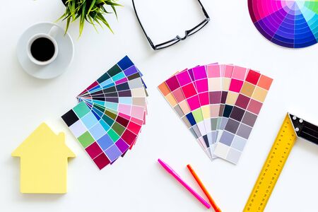
Test Before Committing
Always sample paint colours on your walls before making final decisions. Observe how they shift throughout the day under different lighting conditions typical of British homes. This step ensures you select shades that consistently support the mood and function you want for each room.
By thoughtfully applying these colour psychology principles, UK homeowners can curate interiors that not only reflect personal taste but also enhance daily life—creating spaces that nurture happiness, productivity, and comfort all year round.
6. Implications for Property Value and Appeal
Colour psychology doesn’t just influence personal wellbeing; it plays a pivotal role in shaping the perceived value and marketability of UK homes. When considering the competitive landscape of the British property market, both homeowners and investors should be mindful of how interior shades can directly affect buyer impressions, time on market, and ultimately, selling price.
First Impressions and Buyer Perception
The initial impression a prospective buyer forms often hinges on colour schemes. Neutral palettes such as soft greys, off-whites, and gentle taupes are widely favoured across the UK for their universal appeal and ability to create a blank canvas. Such choices allow buyers to envision their own lives within the space, increasing the property’s attractiveness. Conversely, bold or unconventional colours may narrow the pool of interested parties, as not all buyers will share the same tastes or willingness to redecorate.
Enhancing Space and Light
In Britain, where natural daylight can be limited for much of the year, lighter hues can maximise the feeling of space and brightness within a home. This is particularly valuable in traditional terraced houses or flats with smaller rooms. Strategic use of pale colours helps rooms feel airier and more inviting—an essential consideration for buyers who prioritise comfort and liveability.
The Investment Perspective
For investors seeking maximum return, understanding local colour preferences is crucial. Properties styled with contemporary yet neutral tones tend to attract wider interest, leading to quicker sales or lettings at higher prices. Additionally, subtle accent walls or tasteful pops of colour can add character without overwhelming potential buyers. Aligning interior design with current trends—such as sage greens or navy blues—can further enhance perceived value while maintaining broad appeal.
Regional Variations and Market Trends
Cultural nuances exist even within the UK: urban areas like London may favour modern monochromes, while countryside properties might benefit from warmer earth tones that complement natural surroundings. Keeping abreast of these trends allows sellers and landlords to tailor their approach to specific demographics, increasing desirability among targeted buyers or tenants.
Final Thoughts for Homeowners and Investors
Ultimately, well-chosen colour palettes are a cost-effective way to boost both immediate kerb appeal and long-term value in the UK housing market. By recognising the psychological impact of different shades—and making informed decisions based on current demand—property owners can secure a tangible advantage whether they’re looking to sell, let, or simply enhance their home environment.